Infografiás are pictures that explain information. They mix text, images, numbers, and colors to help people understand a message quickly. You’ve probably seen one before—a poster with facts, a chart online, or a step-by-step guide in picture form. That’s an infografía.
They are great when you want to:
- Show data clearly
- Teach something fast
- Tell a story visually
- Get people’s attention online
2. Why Are Infografiás Useful?
Infografiás work well because they are:
- Easy to understand: Pictures and charts are faster to read than long paragraphs.
- Fun to look at: People enjoy nice designs more than plain text.
- Easy to share: On social media, people are more likely to share a visual post.
- Helpful for memory: We remember images more than words alone.
Whether you’re a teacher, student, business owner, or content creator, infografiás can help you explain your point better.
3. What Makes a Good Infografía?
A good infografía is simple and clear. It should:
- Have a clear title
- Show the most important facts
- Use easy-to-read fonts
- Be colorful, but not too bright
- Use charts, icons, or pictures that match the topic
- Guide the reader’s eyes from top to bottom
The best infografiás are easy to follow and get straight to the point.
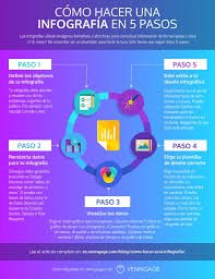
4. Simple Steps to Create an Infografía
You don’t have to be a designer. Just follow these steps:
Step 1: Choose a topic
Pick something you know well and your audience cares about.
Step 2: Gather your info
Write down your key points or collect facts and numbers from trusted sources.
Step 3: Plan your layout
Decide what order your points will go in. Will it be a list, a timeline, or a comparison?
Step 4: Pick a tool
Use an online tool (like Infogram or Canva) to drag and drop elements onto your page.
Step 5: Add visuals
Use charts, icons, and color to make the data easier to understand.
Step 6: Check your work
Make sure the spelling is correct, the design looks good, and the facts are accurate.
Step 7: Share it
Post it on your blog, website, social media, or print it as a poster or handout.
5. Best Tools to Make Infografiás
Here are some free and paid tools you can try:
- Infogram: Great for data and charts. Easy to use and lets you update live data.
- Canva: Perfect for beginners. Lots of templates and simple drag-and-drop design.
- Piktochart: Focuses on reports and educational infographics.
- Venngage: Made for business use, with clean and modern templates.
All these tools let you start for free and upgrade later if needed.
6. Infografiás for School and Learning
Infografiás are great for teaching and learning. Here’s how:
- Teachers can make lesson summaries or explain tough topics
- Students can use them in projects to show what they’ve learned
- Schools can post them on bulletin boards or class blogs
They help students focus, remember more, and enjoy learning.
7. Infografiás for Business and Work
In the workplace, infografiás can:
- Show sales numbers or marketing results
- Explain a business idea or product
- Compare services or plans
- Make reports more fun and easier to understand
Instead of sending a long document, send an infographic—people will actually read it!
8. Infografiás on Social Media
Want more likes, shares, and comments? Use infografiás.
Here’s why they work:
- People scroll quickly—visuals stop them
- Infographics tell a full story in one image
- You can post them on Instagram, Facebook, LinkedIn, or Pinterest
Make sure to keep them short, colorful, and easy to read—even on a phone screen.
9. Mistakes to Avoid
Avoid these common problems:
- Too much text: Use short sentences or bullet points.
- Confusing layout: Guide the reader’s eye from start to finish.
- Wrong charts: Pick the right chart type for your data (don’t use a pie chart for everything).
- Tiny fonts: People should be able to read it without zooming in.
- Bad color choices: Make sure there’s enough contrast between background and text.
Keep it clean, clear, and focused.
10. Why Infogram Is a Good Choice
Infogram is one of the best tools for creating infografiás, especially if you work with numbers or data.
Here’s why:
- It offers over 30 chart types and hundreds of icons
- You can connect your charts to Google Sheets and keep data updated
- It’s great for teams—multiple people can work on one project
- You can download or share your designs online
- It works well for reports, dashboards, and visual storytelling
If you want your infografiás to look professional and dynamic, Infogram is a smart pick.
11. Final Thoughts
Infografiás are a smart way to share information. Whether you’re teaching a class, giving a presentation, or just posting on social media, they help people understand and remember your message.
You don’t need to be a designer. With tools like Infogram, anyone can make great-looking infographics. Just focus on being clear, keeping it simple, and thinking about your audience.
So next time you want to say something important—try showing it, not just telling it.


